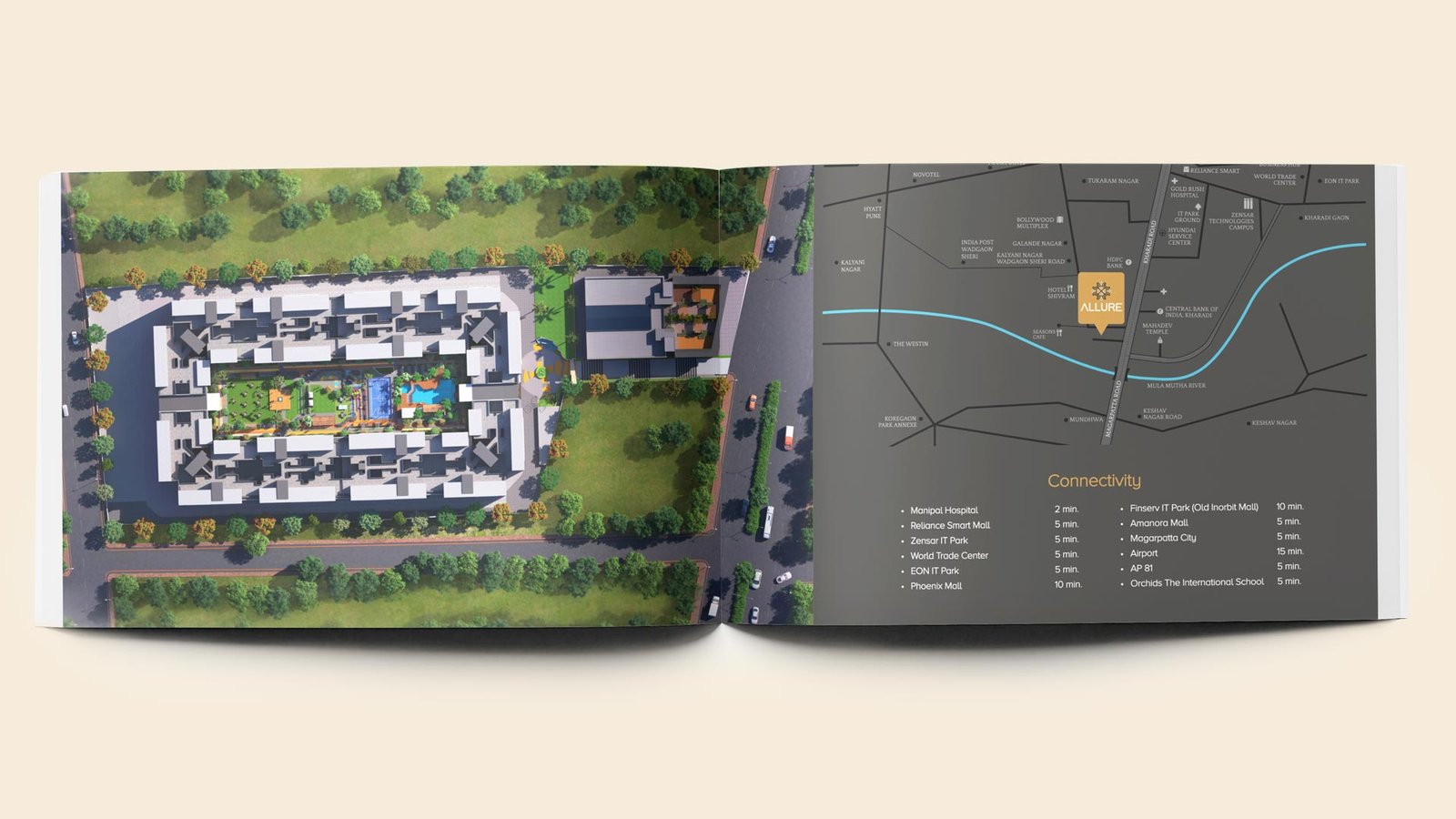
Nestled within the measured calm of East Kharadi and thoughtfully realised across five acres of carefully contoured land, Allure marks Pristine Developers’ inaugural venture into the realm of luxury living. Conceived not merely as a residence, but as a way of life, it represents an ethos rather than just an address.
Kharadi, with its newly earned prominence, provided an ideal foundation; a locale where commerce meets leisure, where daily convenience is paired with aspirational living, and where modern families may anchor their future. For Pristine, Allure stands as both a debut and a declaration: that genuine luxury lies in completeness.
Location: Kharadi, Pune
Client: Pristine Developers
- Brand Identity: A logo system and visual language that translated the fluidity of Vedic thought into contemporary elegance.
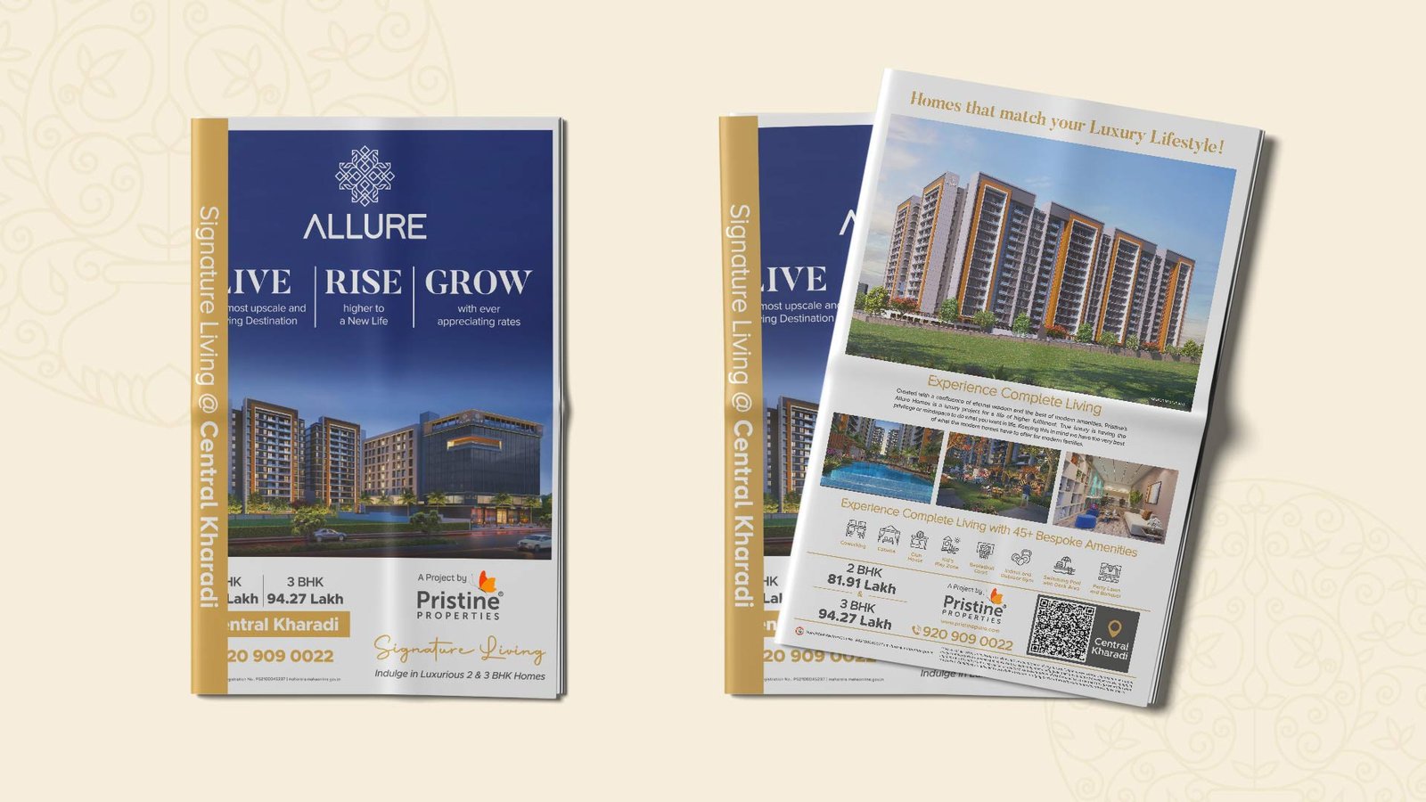
- Marketing Collaterals: Brochures, sales kits, and buyer experience pieces designed to create an immersive experience.
- Social Media Strategy & Content: A narrative-led digital presence that aimed at seeding interest and intrigue.
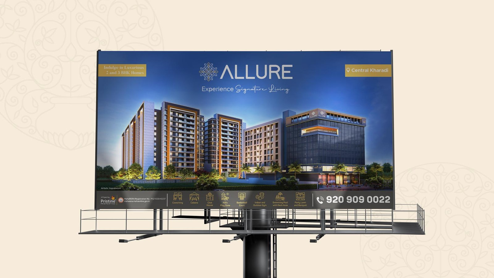
- Advertising Campaigns: Hoardings and outdoor media across Pune.
- Packaging Design: Gifting, welcome kits, and ceremonial touchpoints that reflected the soul of the project.
- Site Branding: Wayfinding, tower signages and entrance identities.
- Launch Communication: Films, teasers, and event collaterals that unveiled the project as one would unveil a secret.
Translating conceptual spirituality into visual and verbal identity is a tightrope walk, especially when it must resonate with an urban, upwardly mobile audience looking to find opulent modern homes, with a touch of culture.
The task at hand was not merely to design the eight Vedic elements, but to summon their presence, to let them breathe through every visual, every experience. The campaign needed to express a nuanced idea: that true luxury is not only defined by comfort and convenience, but by a deeper connection to one’s cultural grounding. In this, the decision to root the project in the eight Vedic pillars of complete living proved both meaningful and magnetic.
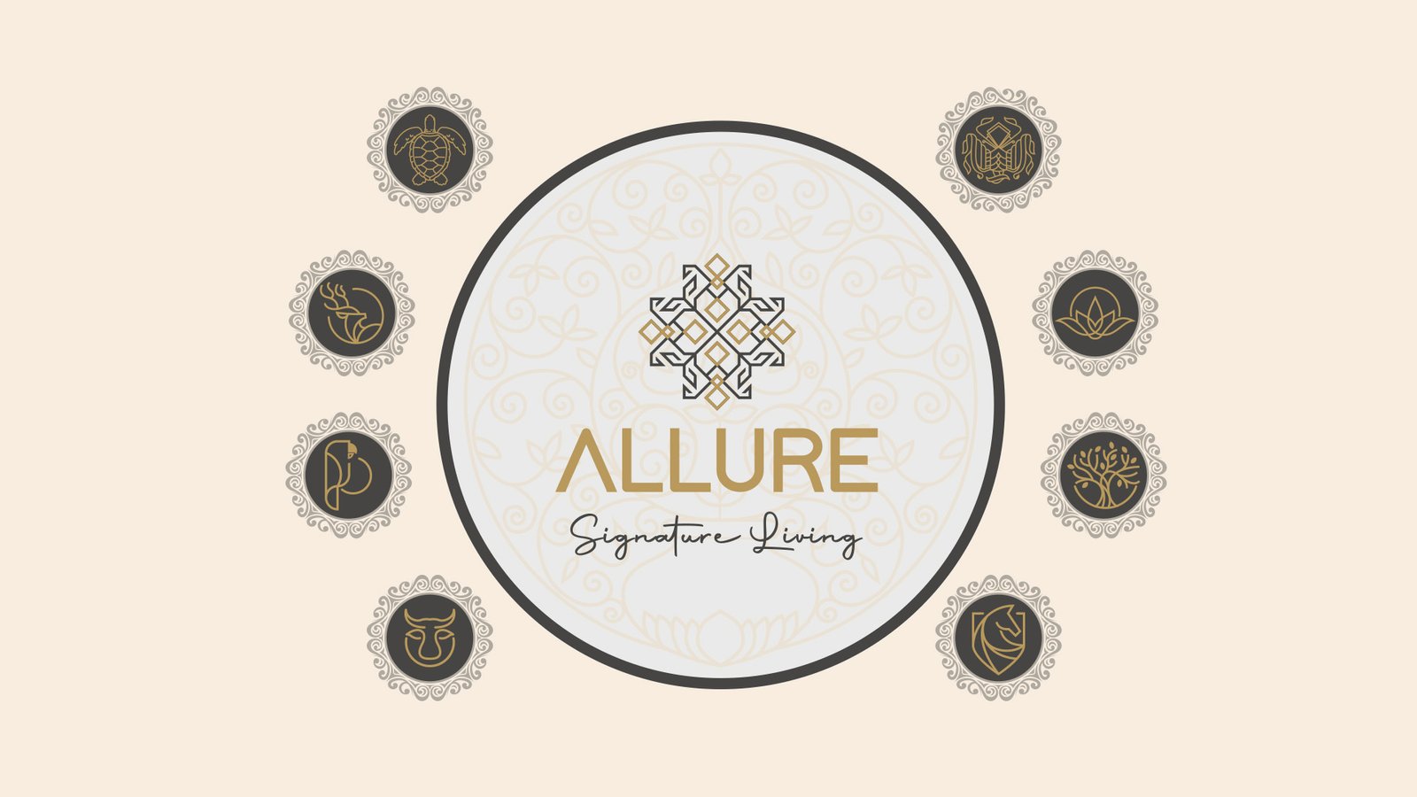
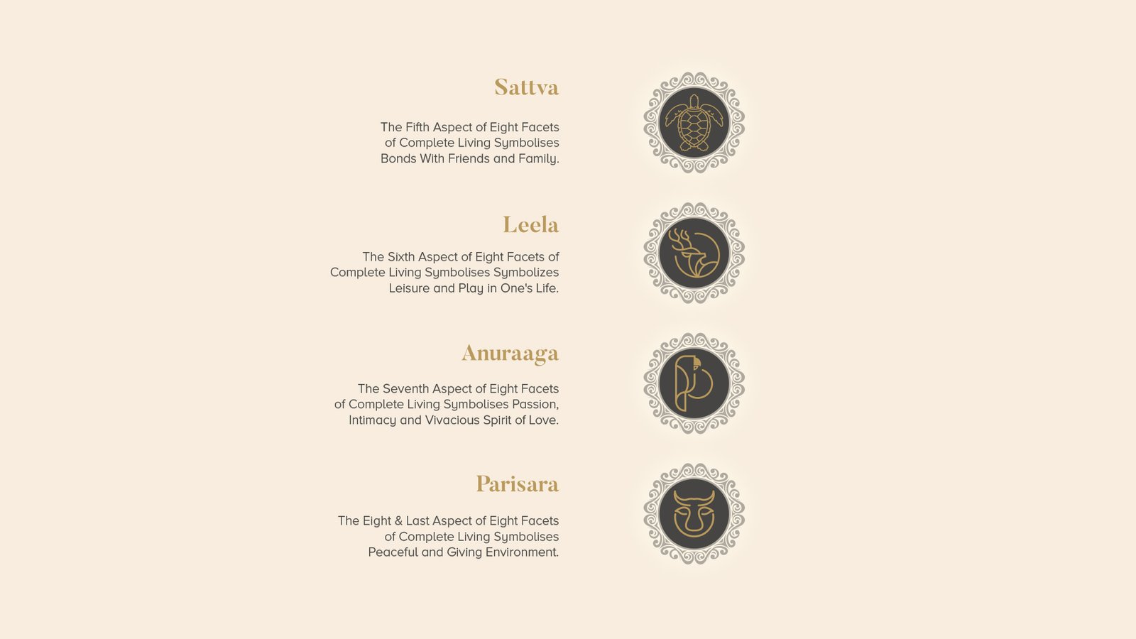
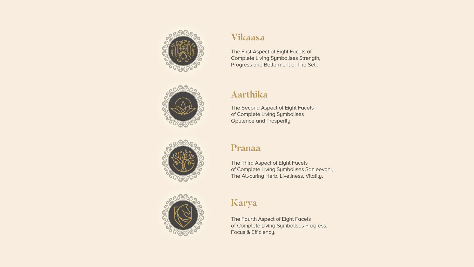
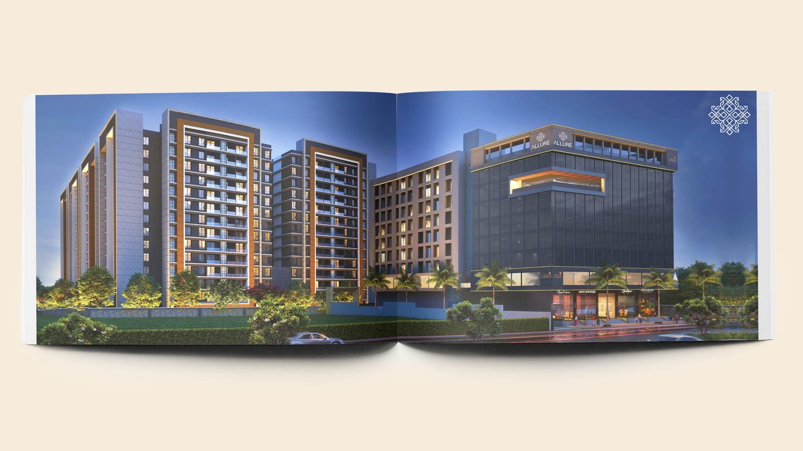
The eight mighty towers conceptualised after the Vedic principle of a fulfilled life lends balance and beauty to the project. The towers include - Vikaasa (growth), Aarthika (prosperity), Pranaa (vital energy), Karya (purpose), Parisara (environment), Anuraaga (love), Leela (play), and Sattva (clarity).
The guiding force behind our work was a single phrase: Complete Living.
Not in the material sense, but in the Vedic sense; a life in equilibrium. We turned to Indian philosophy to find meaning searching for the point where tradition meets tangibility. Every decision, from the typographic weight of the identity to the rhythm of every written word, was made to feel timeless. It was as if the brand had always existed, simply waiting to be remembered.
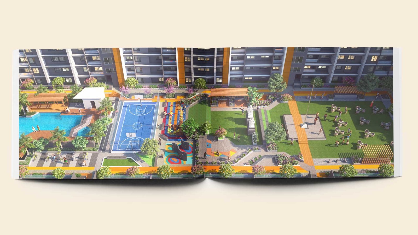
Traditional symbols were woven into the iconography, textures, and colours. These elements were never loud or obvious; they were integrated with intuition and restraint. Every gradient, every spatial arrangement, every detail across the collaterals was crafted to convey a singular message - one of balance, stability, and quiet confidence.
Allure swiftly established itself as a benchmark for premium living. It became a project and campaign that captured both attention and aspiration. As Pristine’s first foray into luxury housing, it stood apart and generated considerable interest. Its success was rooted in more than just its strategic location, elegant spaces, and curated amenities. What truly set it apart was the clarity and conviction with which the entire offering was communicated to its future residents.